During onew of our Media lessons we analysed two school newsletters from different schools. Using various other newspapers, magazines etc we made analysing these newletter covers much simpler due to our familiarity with the reasons behind key features and certain terminology.
We first analysed the Deyes High School newsletter cover. To do this we used our media knowledge such as terminology etc and we found the cover to be easily critisized. The top of the cover displays a pencil drawing of the front building in the school, which gives a respectable image. However, this could also be viewed as not being very modern. Underneath this drawing is "Deyes High School" with the first word "Deyes" being above the words "High School" and written in a larger size. Using media terminology we identified this as the "masthead". The size of this part of the masthead creates a more bold or "eye-catching" image for the newsletter. However, the font and colour do not show any sign of originality or creativity. This is followed by "Specialist Science College" written in a smaller font underneath the masthead; which shows a certain degree specialty and respectability. Another strength would be the scientific symbol underneath that could be viewed as a "puff" and connotates that the school has a speciality in the subject of science. However, the symbol (like the rest of the newsletter) is printed in black and white, which does not give it a very noticeable appeal. Underneath this symbol is "Newsletter 2", and underneath that is "December 2010." While these features may be viewed as important, it could be argued that they are a weakness and do not necessarily need to take up as much space as they do. To conclude, I would improve this newsletter cover by adapting some form of colour and would rearrange it's layout (or completely scrap it) so it is appealing to students as well as teachers and parents.

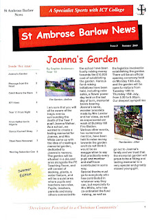
The image above is the school newsletter of the second school which we subjected to analysis; St. Ambrose Barlow. This school newsletter is a lot more effective than ours (Deyes High School), as it has been printed in colour. This instantly gives it a higher appeal in terms of being "eye-catching." This newsletter has incorporated a key feature of many popular newspapers, which is the use of a "red-top" masthead. This gives us a more sophisticated view of the newsletter as it appears to be similar to a real newspaper. Although, the font in which "St Ambrose Barlow News" is written is not particularly visually appealing. Above this, (written in a similarly unappealing font) are the words "A Specialist Sports with ICT College." This, however, gives a somewhat prestigious impression of the school. The newsletter provides (in colour) images of the areas featured in the article, which I believe to be a strength. This is something our school newsletter does not contain. Overall, I will compliment the newsletter's attention to detail, but many of the items featured seem oddly placed. This includes a "puff" which contains the words "Summer Edition." Much like our school newsletters "Newsletter 2" and "December 2010", this information is not particularly crucial.
To conclude, I believe that both newsletters (particularly that of St Ambrose Barlow) are effective in their own unique way and possess some notable strengths. However, there is definitely room for improvement in terms of presentation in both.
No comments:
Post a Comment