Thursday 12 May 2011

Production Log


This is my production log, which documents my progress as I completed my coursework

Wednesday 4 May 2011

Lists of Magazine Production

Actors:

William Davenport
Daniel McDonald
Liam Rudge
Thomas Shortell

Costumes:

William - Black jeans, white shirt, black leather jacket
Thomas - Black jeans, white shirt, smart black jacket
Daniel - Black jeans, t-shirt, hoodie, black leather jacket
Liam - Black jeans, t-shirt

Venue:

Deyes High School Music Studio, Deyes Lane, Maghull

Risk Assessment Forms

Evaluation

Friday 25 March 2011

My Font


I created my masthead in Fireworks, using the font Bodoni MT. I used the Drop Shadow effect for the word "Choon."

Friday 25 February 2011

Research methods

There are two methods I can approach  my my media coursework qualitative or quantitative.

Qualitative - Information on people's thoughts and opinions.
Quantitative - Which is basically numerical questions for statistical purposes.

I feel that qualitative will be much simpler as opposed to quantitative. However, contradiction in opinions may cause problems for me. Although, this broadens the range of things I can research and include.

Mood Board

Moral Panic

Moral Panic is when certain individuals, groups of individuals, certain ideologies etc threaten the social order of societies. A modern example would be that of singers Amy Winehouse and Pete Doherty, who are modern day scapegoats as they are often criticised for their alleged promotion of drugs. They are viewed as a bad influence on the youth of today and threaten the social order.

Historically, another example of this would be when Adolf Hitler was the leader of Nazi Germany. Hitler used the Jewish race as a scapegoat for the problems faced under his rule. He used his severe influence on the media to create the "moral panic" and have his people in fear in order to appreciate his leadership.

The main features of moral panic consist of:

Concern - Behaviour of a particular group that is viewed as threatening.
Volatility - When the situation erupts on a large scale.
Hostility - "Folk Devils" are constructed to divert from the real issue.
Consensus - Widespread acceptance of the threat.
Disproportionality - The severe exageration and fabrication of the actual eveidence.

Semiotic Theory

The general idea behind the semiotic theory is that people receive certain iterpretations when they view certain symbols i.e. colour

Red > Anger

The general semiotic theory behind my music magazine will be based around the indie/classic rock kind of style. This means I will use rather vibrant colour schemes that will attribute to my chosen style and thus make it more aesthetically pleasing to those interested

Wednesday 23 February 2011

Front cover terminology

College Magazine Front Cover


This is my Deyes High Magazine front cover that contains many necessary features that we discussed during lesson time. These include a masthead, headline, pugs, logo etc. In keeping with the schools trademark colour scheme, the main colours are red, white and blue. This creates a familiar feeling with students and parents alike. My featured image is two students from our sixth form that adds a more familiar feel. I have also included the Deyes High School logo, making it more recognisable. For the written text featured I have chosen a more aesthetically pleasing font, as opposed to a simple one. I also felt that the written text would be more effective it lapsed onto the featured image.

Monday 21 February 2011

Feminism

A common "feminist" view is that most modern media texts are predominately male oriented. Society subjected women to severe objectification and it was the norm that they be treated as subservient to men. Feminism was the eventual response to such an oppressive ideology.
The theorist Laura Mulvey idealised the "Male Gaze" theory as a feature of power asymmetry. This technique is often used for the sales of music magazines. The general idea is that by featuring attractive women on the front cover while conveying suggestive thoughts, men will be more likely to purchase the magazines.

Friday 11 February 2011

School Newsletter Analysis


During onew of our Media lessons we analysed two school newsletters from different schools. Using various other newspapers, magazines etc we made analysing these newletter covers much simpler due to our familiarity with the reasons behind key features and certain terminology.

We first analysed the Deyes High School newsletter cover. To do this we used our media knowledge such as terminology etc and we found the cover to be easily critisized. The top of the cover displays a pencil drawing of the front building in the school, which gives a respectable image. However, this could also be viewed as not being very modern. Underneath this drawing is "Deyes High School" with the first word "Deyes" being above the words "High School" and written in a larger size. Using media terminology we identified this as the "masthead". The size of this part of the masthead creates a more bold or "eye-catching" image for the newsletter. However, the font and colour do not show any sign of originality or creativity. This is followed by "Specialist Science College" written in a smaller font underneath the masthead; which shows a certain degree specialty and respectability. Another strength would be the scientific symbol underneath that could be viewed as a "puff" and connotates that the school has a speciality in the subject of science. However, the symbol (like the rest of the newsletter) is printed in black and white, which does not give it a very noticeable appeal. Underneath this symbol is "Newsletter 2", and underneath that is "December 2010." While these features may be viewed as important, it could be argued that they are a weakness and do not necessarily need to take up as much space as they do. To conclude, I would improve this newsletter cover by adapting some form of colour and would rearrange it's layout (or completely scrap it) so it is appealing to students as well as teachers and parents.

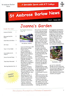
The image above is the school newsletter of the second school which we subjected to analysis; St. Ambrose Barlow. This school newsletter is a lot more effective than ours (Deyes High School), as it has been printed in colour. This instantly gives it a higher appeal in terms of being "eye-catching." This newsletter has incorporated a key feature of many popular newspapers, which is the use of a "red-top" masthead. This gives us a more sophisticated view of the newsletter as it appears to be similar to a real newspaper. Although, the font in which "St Ambrose Barlow News" is written is not particularly visually appealing. Above this, (written in a similarly unappealing font) are the words "A Specialist Sports with ICT College." This, however, gives a somewhat prestigious impression of the school. The newsletter provides (in colour) images of the areas featured in the article, which I believe to be a strength. This is something our school newsletter does not contain. Overall, I will compliment the newsletter's attention to detail, but many of the items featured seem oddly placed. This includes a "puff" which contains the words "Summer Edition." Much like our school newsletters "Newsletter 2" and "December 2010", this information is not particularly crucial.
To conclude, I believe that both newsletters (particularly that of St Ambrose Barlow) are effective in their own unique way and possess some notable strengths. However, there is definitely room for improvement in terms of presentation in both.

Friday 14 January 2011

Welcome to my blog

I have created this blog as part of my media assignment, in which I will be studying the music industry and  the magazine industry to create my own music magazine. I will be researching two music front covers, two contents pages, two double page spreads, one analysis of a college magazine, one college magazine front cover and one contents mock-up. After doing this I hope to have decided on the route that I would like to go down with my own magazine and will then justify my decisions that I have come to when I begin to create the magazine.

Please feel free to leave any comments